Playing around with some different new feature ideas for the site… If you guys could vote on whether you’re interested in some of these ideas, that would be awesome.
Live Four Factors / Game Reports (basically generate ad hoc four factors graphs like I always post plus some other stats and graphs):
Love it
Meh
Not interested
0voters
Short game day preview pods/game breakdowns. Essentially an audio scouting report.
Love it
Meh
Not interested
0voters
Members-only Q&A/mailbag session at the end of podcasts (last 20 minutes or so)
Love it
Meh
Not interested
0voters
Some live video/hangout/Q&A/space/etc. sessions (pre-game, game day, etc.) in a format to be determined.
Love it
Meh
Not interested
0voters
Player stat pages tracking performance over the season (trends, advanced stats, shot charts, historical player bullets, etc.)
Love it
Meh
Not interested
0voters
Bringing back some more “film room” type content focused on X’s and O’s.
Love it
Meh
Not interested
0voters
More formalized in-game posting (from me) outside of the open thread. More of a live blog with game thoughts as it goes on.
Love it
Meh
Not interested
0voters
Open for more feedback, too, if there are types of content you would like to see more of!
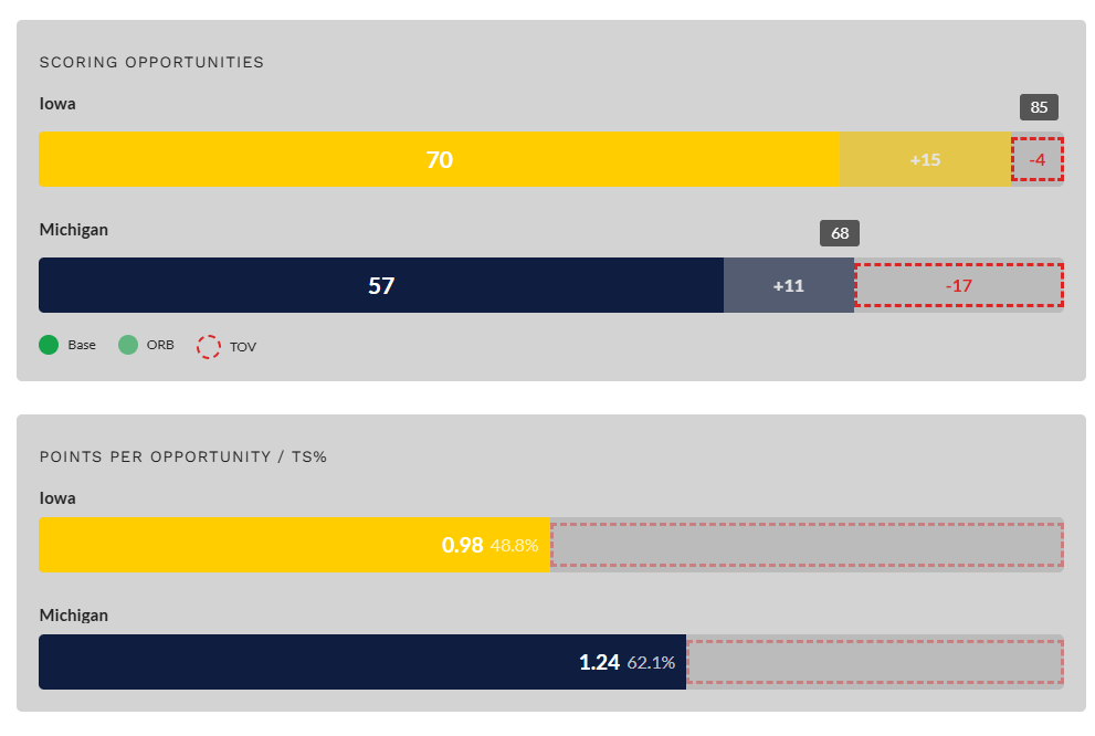
I know the polls are anonymous, but I usually watch the game and then check for four factors every deadball/timeout and would absolutely love this. I have a hard time going from cheering to looking at score and then contextualize if the offense/defense are playing good or not based on per possession stuff
conversely, the tough thing about pre-game video/audio is it becomes out of date so fast - a post-game report i have at least 2-3 days to listen to before anything changes, but if you do a pre-game thing the day of, i have maybe six hours to listen to it, and a lot of that is working
This is an interesting point I guess, but I don’t know that like post-game reaction stuff lasts that long because there’s another game coming too right? Obviously a bit longer.
The trouble with post-game is that there’s less time to formulate a reaction to when people want it
Just had another thought and I don’t know how hard it’d be to do at all so not a big deal, but maybe putting the KenPom projected PPP under the actual PPP would be kinda cool for live comparison sake?
Yeah I’m constantly looking for it for our and other B1G games. The upgrade of that graphic plus the full box scores over the bad app offerings is a LOT.
want to call out a quiet fix - when you read half of an article then get prompted to log in, it used to just kick you out to the homepage instead of refreshing the article. it was not a huge deal but it was annoying, especially if it was postgame and you’d opened a bunch of articles at once. but i just had to do it for the gayle article and it looked like an updated login UI and it refreshed the article after I logged in. thanks dylan!
The four factors is my go-to. It tells us so much about what is happening in the game. If we only got one graphic that would be my choice. The box score is fine, but when I want specifics it is usually just easiest to go the ESPN app or any other score app.
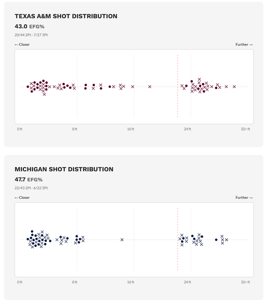
I really like the shot distribution chart. Very straight forward and easy to interpret. Also, a great reminder why we beat TAM.
The scoring opportunities one is not clear to me, or maybe just not intuitive to me. A possession where we take a jump shot, get an offensive rebound and then score would be two opportunities and then one possession. Points per opportunity is then the equivalent of points per possession with using opportunities instead of possessions?
So it’s basically TS% and TSA (the denominator for TS%).
TS = Points scored / ( 2* (FGA + 0.475*FTA) )
Essentially how many “shot equivalents” a team gets in a game.
Offensive rebounds don’t lead to another possession, they extend them. So basically it shows what people often refer to as the “possession battle”… I.e. offensive boards and turnovers.
Iowa had 17 more shot equivalents than Michigan but Michigan won becuase it was so efficient.
Michigan routinely lost the scoring opportunity battle last year, which inspired me to create the chart (along with obvious inspo from dunksandthrees.com)
That’s the idea… basically a visual that you can imply from the four factors but not always map out directly. Maybe it needs improved or explained though.